Saturday, October 3, 2015

Projector Photography

photography and layout by me. model: bea adams

TIPS

  1. To achieve a black background, place the projector on an angle. Then, take a shot while in front of the model.
  2. Have someone hold the projector so you can position the projection in interesting ways.
The photo on the extreme right uses a snoot to have a rim light (though it doesn't look like a rim light in my photo)

This spread was used in my portfolio/photo album requirement for our final exam. 

Studio flash shoot (Actual model shoot)

photography and layout by me. model: charles
I used a 1 studio flash (I think it was 600 watts, it was huge) in lowest power and placed a little far back. Behind the model (not directly behind) a snoot was placed to create a little bit of dimension. The shoot was themed Alice in the Wonderland/Indie-fairy-something, hence, the background and the outfit.

photography by me. model: charles
Another favorite shot. Charles is a cosplayer so she was a natural when it came to posing.

Studio flash shoot (Rehearsal)

photography and layout by me. model: adonna velez
Using a snoot, an external flash, and some colored gels (though we used colored CD cases) we had a very fun and colorful shoot. I wanted to do this kind of photo shoots because I really love colors in photos. The red creates a really dramatic effect.

To get this shot, I had one of my classmates hold the external flash above the model while holding a colored 'gel' in front of the flash (I believe it was a violet/purple color, which you can see clearly in the photo on the left side. Another person was holding a red colored 'gel' in front of the snoot to get that red color.

Saturday, August 29, 2015

Light: Zones, Reciprocals

At this point, I already know that you can control the light using the exposure triangle: Aperture, ISO, and Shutter Speed. This week, we went to a more advanced lesson about controlling light. It was quite advanced actually, thank God I didn't get lost.

WE learned about the middle gray, which is what the camera does to a white or black space. It never really shows white, and/or black, instead in translates it to a middle gray.

Another thing we tackled is the different metering the camera uses. These are (based on my camera which is a Canon 1200D) Evaluative metering -- the default setting, this makes the camera evaluate the whole composition, -- Partial metering, and Center-weighted average.

We also discussed the Zone System, popularized by Ansel Adams. This zones also correlates to the exposure 'meter' on the camera. With '0' as the Zone V(5) and is the middle ground, '-3' as Zone II(2) which is PURE-BLACK (underexposed), and '+3' as Zone VIII(8) or PURE-WHITE (overexposed).

The following photos are taken as an example to show reciprocals, which is, different settings (relative to your base setting), but same exposure. 

Disclaimer: These photos are NOT similar EXCEPT for their exposure.

BASE SETTING: Shutter Speed 1/500, Aperture 4.0, ISO 200

SAME APERTURE: (RELATIVE TO BASE SETTING) Moved Shutter Speed 1 stop darker (1 stop darker=doubled the base shutter speed): Current SS 1/1000, to balance this, I moved the ISO 1 stop brighter: Current ISO ISO-400

SAME ISO: (RELATIVE TO BASE SETTING) Moved the Shutter Speed 1 stop brighter (1 stop brighter=divided the shutter speed to two): Current SS 1/250, to balance this, I moved the Aperture 1 stop darker (so from f/4.0, I moved 1/3 stop(4.5) to 2/3 stop(5.0) to f/5.6) [THIS MEANS I MOVED TWO SPOTS TO GET TO 1 STOP]): Current Aperture f/5.6

SAME SHUTTER SPEED: (RELATIVE TO BASE SETTING) I moved the Aperture 1 stop darker: Current Aperture f/5.6, and to balance this, I moved the ISO 1 stop brighter: Current ISO ISO-400

Monday, July 27, 2015

Alphabet Photography

ALPHABET PHOTOGRAPHY. Photo of photos on a photo

WITHOUT the light, the photoshop, the set, the costumes, and all the other technicalities, what would a photo be? What can it make interesting?


I think, the sole importance of this activity is to train our eyes on finding the perfect composition. To find that angle that makes a photo amazing. Amidst all the clutter, and all the shapes and lines and curves, we struggled to find the perfect angle to reveal a letter which would complete our alphabet.

Without all the fanfare, just a certain angle can make a simple, uninteresting shot to a 'money shot.' It takes one good eye to find this angle.


Lighting Patterns


SPLIT LIGHTING. Model: Lenore Quibael

THERE ARE several lighting patterns that you can use to create an interesting photograph. Here are the 4 basic light patterns that are essential for every photographer to know.

1. SPLIT LIGHTING

Split Lighting -- as the name suggests -- splits the face in halves, one in the light and one in the shadow. This creates a really dramatic effect. This is applicable, but not exclusively, to men. To achieve such look, a light is placed 90 degrees to the left or right of the subject.

Other variations include SHORT and BROAD lighting.

2. LOOP LIGHTING

In Loop lighting, a shadow of the nose is cast on the subjects' cheek.

3. BUTTERFLY/GLAMOUR

BUTTERFLY LIGHTING. Model: Angelica Fandialan
Butterfly lighting is achieved by placing the light directly above and behind the camera. This creates a 'butterfly' shadow under the nose. It also creates shadows under the cheeks. This is often used for glamour shots.

4. REMBRANDT LIGHTING

Rembrandt Lighting is characterized by one thing: a triangle on the subject's cheek. This was taken from Rembrandt's various portraits, which displays the same pattern. This lighting pattern often creates a dignified look. It is also applicable for subjects with high cheekbones. 

REMBRANDT.


more about lighting patterns here 

Light Painting


POWER. Model: Angelica Fandialan
Original concept I wanted to try. Photo by Patrick Rochon

LIGHT PAINTING is done by exposing your image longer to capture the path of light you are using to draw. This is easier to do in pitch black situations/places (I mean, duh, but we really struggled with our shoot because it was afternoon so we had to find the deepest, darkest, most evil -- just kidding -- place in UPLB (where we shot). We ended up shooting in this basement area. The place looks abandoned except that, there was a choir practice happening, which made it, well, sinister.)

The photo above was shot with a Canon EOS 1000D. ISO was set to ISO 100; aperture to f/29, and; exposure time was 30 seconds. I played with a lot of concepts. The first photos we shot was in an empty space, but it had windows so it was very tricky. Another concept I wanted to try was to use different colors of light to paint, unfortunately, I wasn't able to bring a lot of colored lights. Sadly, it didn't really work for me, so I asked a friend to model for me. I used a white light and a yellow light. The yellow light proved to be a great addition because it gave a little color to the skin. I also used the yellow light to create an 'energy ball'. The white light was mainly used to light the background and my model.

It was really challenging to capture the photo above because the model had to stay in that position for 30 seconds, which may seem to be a short time, but it seemed forever. Kudos to her, she made it look so effortless.

What we did above is just one idea to try when doing light painting. There are a lot of examples you can find in the internet, here are some interesting ones:

From http://www.q8ieng.com/


Photo by Samantha Wild


Saturday, March 21, 2015

Learnings: Photo to sketch, and a variety of "faux art" effect

By zander esteban (that's me)
Photoshop is a very good tool to make fool-proof artistic effects. A variety of tools that are used to be on your art materials drawer can be found in Filter>Filter Gallery. These effects include but are not limited to watercolor, charcoal, colored pencils, and other sketchy sketch effects.

While it will be much nicer if you'd first try creating a real art with real art materials (I've tried the tools listed above, most are not easy to put up with) just for the sake of saying "Well, I tried."

Another very sketchy tool you can use is the art history brush tool. It provides a variety of brush strokes to use. And it's easy to use too as it works just like a normal brush tool.

Learnings: Text Portraiture

You may not mask the text outside of the pic. by Jerm Narvaez


The art of text portraiture is easily to be mistaken as a bunch of work when in fact it is a click-this-click-that-and-you're-done kind of job. Just get your desired picture, make sure to replace the background with white (if it's not already white). Now desaturate it and save it as a .psd file - this is essential for the displacing you're going to do later. Now create a new layer that is filled with black. Then start carefully and randomly placing the text, you can use a single line or quote, name, whatever your heart desires, or a variety of them. You can just duplicate these text by holding alt (which will transform your cursor into a double cursor) and clicking on the text and dragging the text. Make sure to use a varitey of sizes. AND MAKE SURE THE TEXT IS WHITE. Now once you feel you've covered your subject, merge all your text with the black layer , go to Filter>Distort>Displace, put in the value 15 on both horizontal and vertical displacement. Select the black and white .psd file you created. Now change the blending mode of the merged text to light burn. Mask the text outside of your subject and you're done.

This was what I was working with. The finished file aswell as the .psd raw file got lost while I was transferring files from my flash drive to my laptop =( This screenshot was the only thing left of its whole text portrait glory.


Wait, that IS a lot of work.

refer to this tutorial.

Learnings: Using the Vanishing Point

One of the Photoshop power tools is the ultimately helpful and magical Clone tool, used to make just about anything unwanted to disappear and/or make something double (triple, quadruple and so on...) by cloning. But one problem that we often encounter is that the clone tool basically works on a flat plane.

Worry no more because the Vanishing Point "tool" is here to rescue. Found in Filter tab in Photoshop, the vanishing point allows you to place vanishing points, by mapping planes according to the perspective of your picture. With this, you can now clone in perspective, no more uneven clones that result to weird photos.

Also, you can basically add anything to your photo, like layouting a wall in perspective by pasting and moving whatever the heck you want to put in your picture.

With Photoshop, you've got the power!

Learnings: 3D Anaglyphs

3D Anaglyphs are photos that have a three-dimensional effect often used to emphasize a certain part of the photo. Now, the only 3D anaglyphs we consider legit are the ones that actually work, and using effect generators (such as your easily accessible apps on your smartphones) will be considered cheating.

Put your 3D glasses on! Oscar selfie 3D anaglyph style*. By yours truly.


3D anaglyphs can be made with Photoshop. This effect can be achieved by first making a depth map, that is, a black-to-white rendering of the picture. You paint those you want to appear in front white and those you want to recede in the background (remain flat) black. You can use a variety of shades of gray as a middle ground and/or to have a smooth transition that allows a popping out-of-the-pic effect. This depth map is then to be saved as a .psd file. This is essential for the next step which is displacing the red and blue channels to the left and right, respectively. By going to Filter>Distort>Displace, then typing how much do you want the picture to be displaced horizontally. Select the depth map .psd file and voila! You now have your legit and working 3D anaglyph.

Of course to be viewed with 3D glasses (not polarized)

Check out this moving 3D pic of rapper M.I.A. by Romain Gavras. Cool!


*issues with viewing to be blamed to the internet :p

Saturday, January 24, 2015

Learnings: Logo Design

A million dollar business

You may think that designing a logo is just a lazy process. Little did you know that designers put all their heart and soul to every logo they have made. Every inch, every pixel, is product of hard work.
- Adonna Velez 

Friday, January 23, 2015

Learnings: The Type Tool

The Type Tool

The power of words is unparalleled. Words can speak of courage, empowerment, love, hatred, anger, and a lot more. Words can be inspiring. But without the Type Tool, this words will never be . . . . well, typed.

Words can also be used as a design aesthetic, you can either put it with a picture or manipulate it so it can be as interesting as a photograph.

"Are there pictures?"

Reading can be such a burden. Whenever people are handed a book the first thing they would do is look for photos. Words are never interesting - until the type tool came.

To access the type tool, left-click the T icon in the toolbox near the canvas. You can also easily access it by clicking the same letter on your keyboard. T for Type Tool, easy, right? Right-clicking the icon will give you more options such as the Vertical Type Tool, which instantly allows you to type vertically. You can change the typeface, as well as the size of the font by accessing the drop-down menus. Beside the sizes, you'll see another drop-down menu which determines the quality of the font. You can change the color of the font too. And an interesting feature awaits after click the icon that shows a T above an arc, you'll be offered a variety of choice to arc/bend the text in different ways.

More features

More features to toggle with are available in the Character menu, found parallel to the toolbox. To access the menu click the icon that shows an A with a vertical line beside it, if you can't seem to find what I'm describing to you, enable the Character menu by going to Windows>Character.


(A) Font (B) Leading - the space between lines of text (C) Tracking - uniform space between the letters (D) Stretches the letters vertically (E) Stretches the letters horizantally (F) A number of options to style the font such as [from left to right] Bold, Italic, Uppercase, Small Caps, Superscript, Subscript, Underline, and Strikethrough.
**left side of B: Font size
***left side of C: Kerning - space between two letters
****below D: Baseline shift - allows to move the letters above and/or below the baseline

IN SUMMATION

Typography is not as easy as brushes. And it is far more technical than colors. Words need to be understandable. They are not just there to be an aesthetic to the design. Of course they are there to add beauty, but not JUST beauty. It has to have a purpose. Whatever you want to say, make sure it has a purpose, or else just shut up. :)

signing out . . . . . . . . 

Learnings: The Brush Tool

The Brush Tool

There is this one tool in Photoshop that is powerful. With it you can create anything; the possibilities are endless. It goes by the name of "brush."

Now when do we usually use a brush? In the real world you need a brush to paint and in Photoshop the tool is basically the same.

The brush tool is one of the numerous tools that is available in Photoshop. It is located on the right side (by default) of the canvas, inside the toolbox. You can easily access it by pressing the letter B on your keyboard.

Mother of tools!

I would say that this tool is powerful because most of the tools in Photoshop was based on brush and/or functions like one. Only that for different tools, they have different functions (duuh), but to explain some tools, you would have to refer to it as "use it like a brush."


The Power

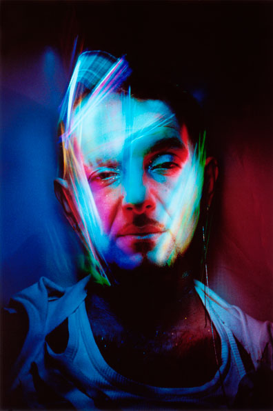
Brushes are amazing. You can literally make an artwork just by using brushes - just like the picture above. I used a variety of brushes to mask and design the photo. Photoshop allows you to use a variety of brushes. There are presets available. To view these, you can click the arrow on the side of the brush preview (after you select the brush tool) or just select the brush tool and then right-click anywhere inside the canvas. You can also change the size by accessing the same menu that shows the other brushes available, just toggle the toggle thingy (I don't know the right term teehee) or just use the [ key to make the brush diameter smaller and the ] key to enlarge it.

The Power: Part 2 - Just can't get enough


But that's not all. Photoshop allows even MORE options to customize each brush. On the left side of the canvas you'll find an icon that looks like a can of brushes (if you're not able to locate it, it's probably disabled, so you'd have to go to Windows>Brush or just use F5 on ya keyboard) left-click it and it'll take you to Wonderland - of brushes for that matter. More options await you such as Shape Dynamics (allows you to change the angle, roundness, and size of the brush), Scattering (gives the brush an automatic scattering effect so you don't have to scatter each and every brush point no mo'!), and Color Dynamics (my favorite one! basically, in one brush stroke, there will be variety of shades, tints, and colors available.)

The Power: Part 3 - You didn't thought it's gonna be this interesting with brushes

Okay, did I already tell you brushes are amazing? Because it is some kick butt tool you know. Now this is like the cherry on top of the features of the brushes tool. I have already told you that Photoshop gives you a variety of brush presets you can use. But if you get bored (which is less likely to happen because BRUSHES ARE AMAZING), don't you worry, Photoshop allows you to install brushes to its system. Aaaaaah! That's more brushes for you. You can download brushes online (don't worry a lot of them are free). There are websites such as brusheezy.com where you can download several brushes/brush packs for you to install. And don't get worried about installing them, it isn't very technical. After selecting the brush tool. Go to the menu that we use to resize the brush. Now, just near the size toggle thingy there's a little gear, left-click that and then choose "Load Brushes...", now find the file you downloaded, choose "Load" and voila! the set of brushes you just downloaded are now loaded along with the pre-existing ones. 

BUT WAIT THERE'S MORE. The Photoshop gods have allowed us, puny, creative humans to make our own brush. Which is fun! Just load the picture you want to make as a brush. Now, you can select a part that you want to make into a brush using the selection tool (and other tools that allow you to select). It can be ANY shape you want. Now, having selected the part you want to use, go to Edit>Define Brush Preset, you can rename it, then choose OK. And now you can finally use your face as a stamp!

IN SUMMATION

Photoshop gives us a variety of tools to help us with our design/designing. Most of them functions just as their real-life counterpart and/or namesake. And with the power of brush tool you can create anything.

signing out . . . . . . . .